
Description:Did you know that colors can influence the behavior of children? That is what the study of color psychology for children is all about! Find out what colors are the best to stimulate a learning environment and more. Read the full post for details.
Color psychology refers to the study of colors as they relate to or influence human behavior. How it influences people varies based on age, gender, and culture, but some are universally accepted as having certain qualities. This area of study in psychology is largely influenced by theories relating to perception and hue, known as color vision psychology by Isaac Newton.
Parents might be familiar with the popular advice of picking ‘soothing' tones like white and blue for a baby room - this has everything to do with color psychology for children.
It is used in almost every area of our lives - but we are not always aware of it. Have you noticed that you assume red with danger? It probably has something to do with the fact that red means you should stop at the traffic light. Or that most signs warning us of danger are red?
As children grow up and become accustomed to the meaning of certain colors, parents can use color psychology for children as a method to facilitate learning.
Color psychology for children requires parents to be aware of the qualities and behavior of their child and choosing tones that complement the attributes and personality of the child. Once the particular colors are identified, parents then make a conscious decision to incorporate as much of it into the life of their child.
Often, parents choose colors for their unborn children and decorate their nursery with them - referred to as the psychology of color in interior design. Here is an example of the meaning of nursery decor:
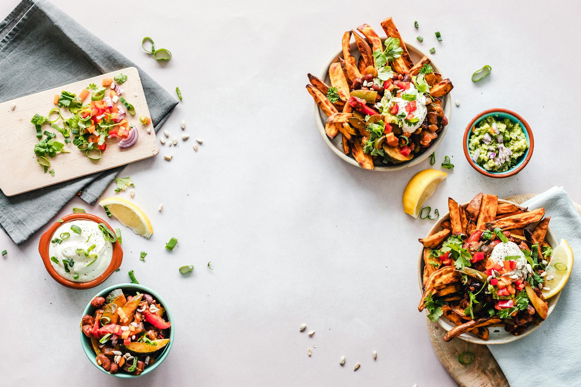
The most popular use of food color psychology by far is the marketing of fast food brands. Brands such as McDonalds and Dominoes choose color combinations in their logo and branding material that is memorable. Its effective use means that if we see the logo anywhere, we know what brand it represents.
It is also used in the identification or description of different flavors. The food and flavor references are culture-specific. Here's a quick example:
If you are conscious of color psychology for children, you should be aware of clothing color psychology and choose the clothing of your children carefully. Have a look at this simple guide for clothes:
While we are on the topic of color psychology for children - let's talk about toys! If you go to a toy store or do some online toy shopping, you would notice that toys for 2 year old girls have a particular color palette, right?
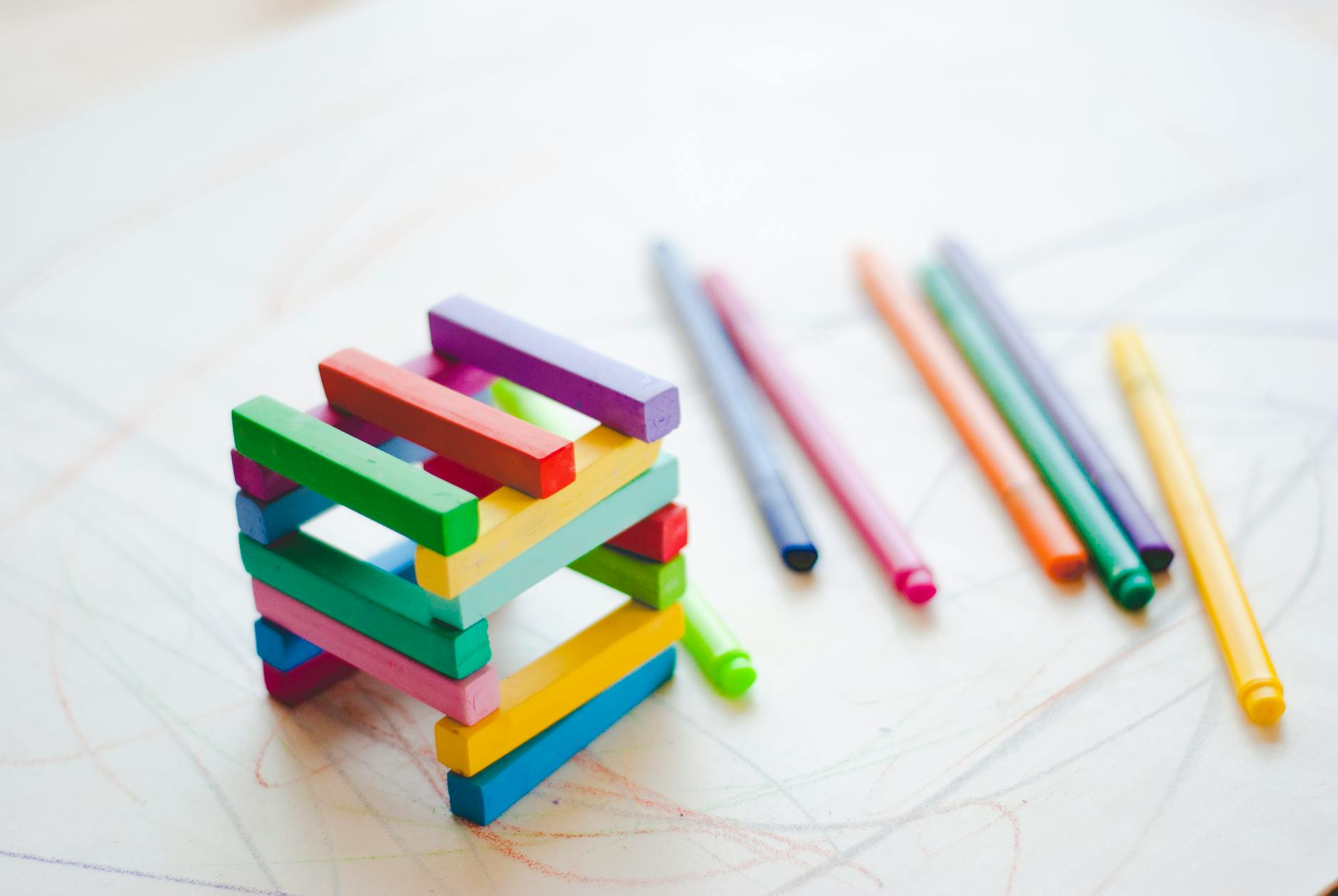
Color psychology for children is often used in the classroom and learning spaces to facilitate and encourage healthy patterns of concentration and learning. We see this in the color palettes of classrooms and educational websites, of course, these colors also correspond with the target age of the learning facilities.
If you want to create a conducive learning environment, try this:
Because of the unique qualities of each color, classrooms are often decorated in various bright and light tones. For adult workspaces, colors are incorporated through décor items like pillows and vases.
It is a condition that affects the way color is perceived. The retina of the eye has rods and cones that allow us to see different tones; a defect in the cones leads to the condition that is known as color blindness. Color blindness psychology investigates how people with this condition see and experience color.
The condition varies; for example, some people can't see red/green colors while others can't see blue/purple combinations. This just means that they see a different shade of the color - for example, red might appear to be less bright than what it normally is. The cases where people see only in black, white, and grey are extremely rare.
What color represents your personality? We would love to hear about it in the comments!
How is color psychology used?
Food and color psychology
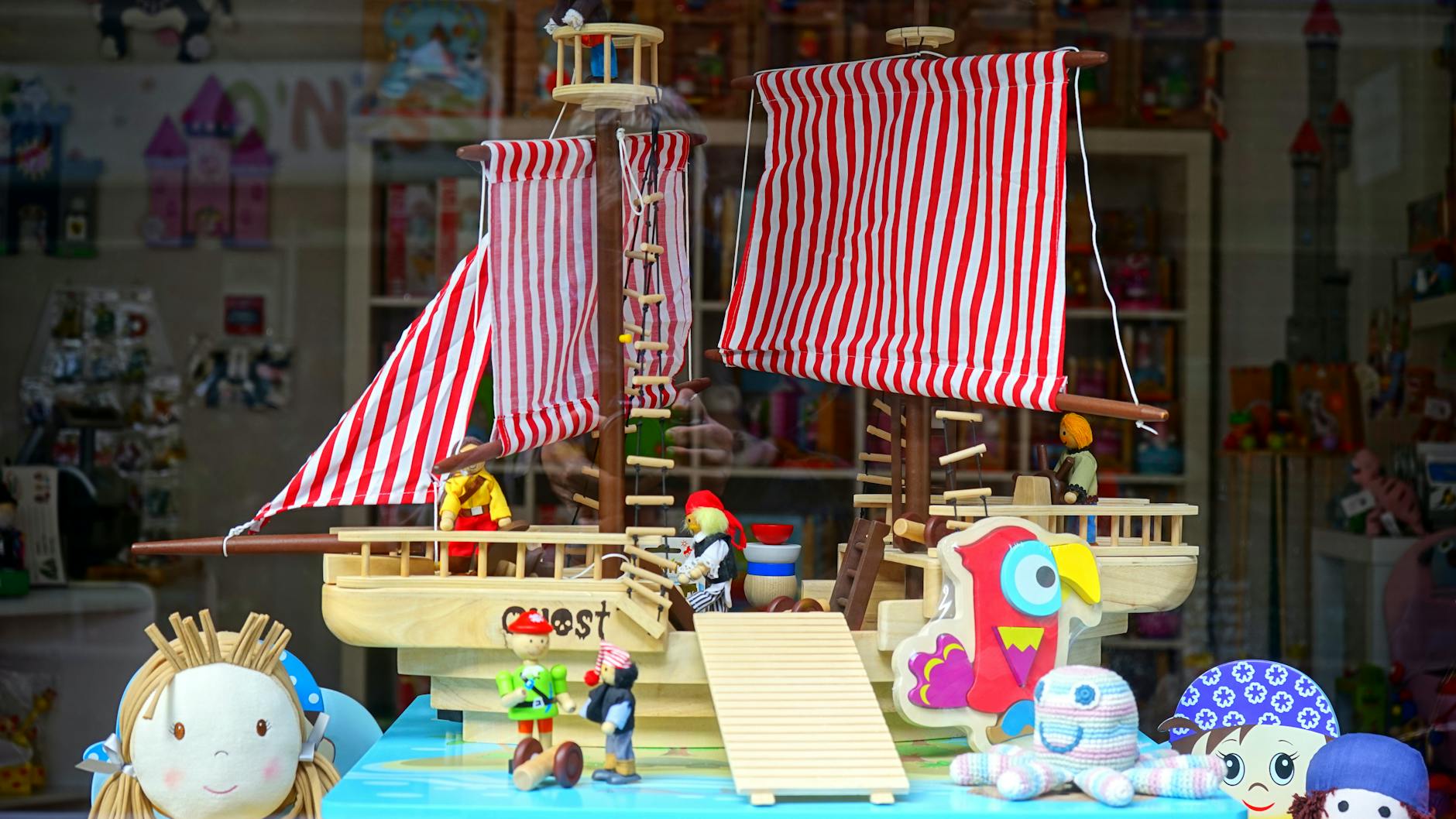 A lot of that has to do with normative conceptions of gender. For example, toys for girls should be pink and for boys blue. But research shows that children tend to recognize primary tones and associate it with memories of their favorite toys or something they hold dear, like a doll or teddy.
Theories of color psychology for children also suggest that bright palettes like blue, red, yellow, green, pink, and orange grab the attention of children and evokes a sense of curiosity.
A lot of that has to do with normative conceptions of gender. For example, toys for girls should be pink and for boys blue. But research shows that children tend to recognize primary tones and associate it with memories of their favorite toys or something they hold dear, like a doll or teddy.
Theories of color psychology for children also suggest that bright palettes like blue, red, yellow, green, pink, and orange grab the attention of children and evokes a sense of curiosity.
The learning environment
 In the same way that color psychology for children is used in learning environments to encourage learning, color psychology in movies is used to evoke emotion in films. It is used in movies through background, décor items, clothing, food, cars, and other items. Many times, natural light is also used - for example, the orange sunset or night sky.
Here's a breakdown of the most popular tones used in the film:
In the same way that color psychology for children is used in learning environments to encourage learning, color psychology in movies is used to evoke emotion in films. It is used in movies through background, décor items, clothing, food, cars, and other items. Many times, natural light is also used - for example, the orange sunset or night sky.
Here's a breakdown of the most popular tones used in the film:
What is color blindness?
Author's bio
Rachel Burns is an experienced copywriter and photographer with a design diploma. She works with startups, entrepreneurs, bloggers and companies from around the world. In addition to writing articles and promotional materials, she enjoys hiking, reading, cooking and spending time with her family.